 Affiliate Dashboard
 Promotional Events
 Hot Deals
 Our Policies

T55 Pro Max Smart Watch With Earbuds & Double Strap- Black Color
Original price was: ৳1,950.00.৳1,350.00Current price is: ৳1,350.00.
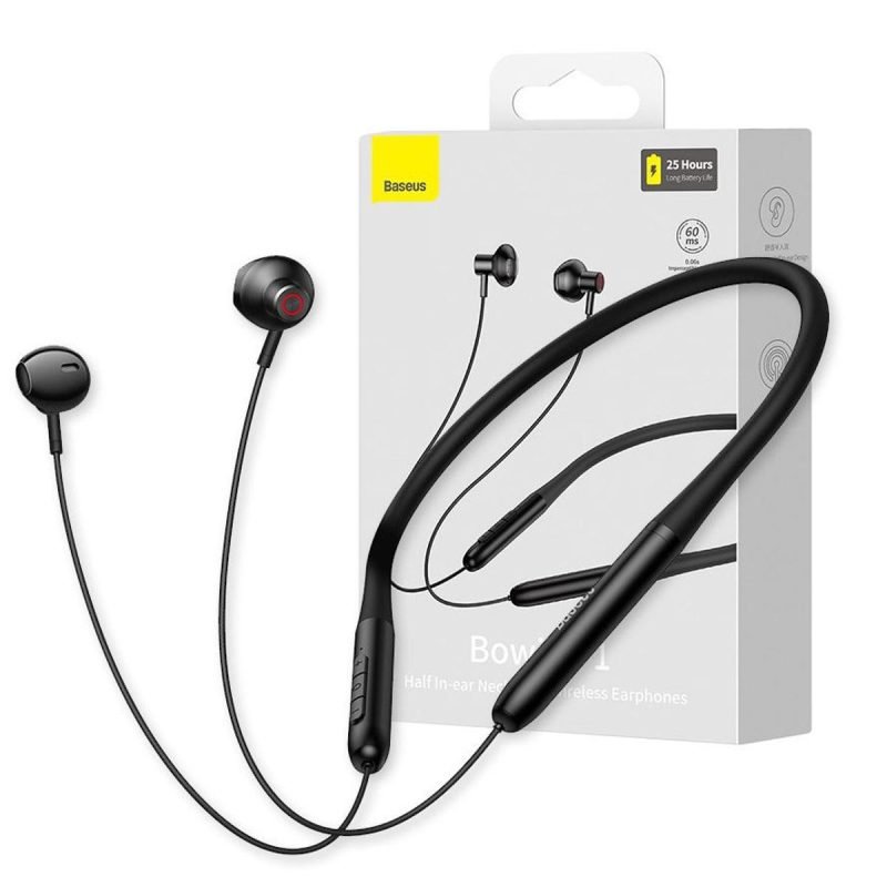
Baseus Bowie P1 Neckband Wireless Earphone
In stock
Original price was: ৳2,950.00.৳1,700.00Current price is: ৳1,700.00.
SKU:
DGT-1012823
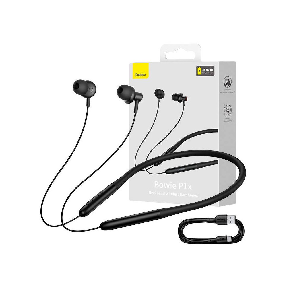
Baseus Bowie P1x Neckband – Black Color
In stock
Original price was: ৳3,200.00.৳2,100.00Current price is: ৳2,100.00.
SKU:
DGT-1013978
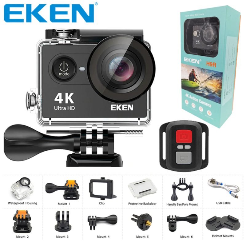
EKEN H9R Action Camera with Accessories
In stock
Original price was: ৳10,900.00.৳6,900.00Current price is: ৳6,900.00.
SKU:
DGT-107320

G8 Sports Neckband With Magnetic Headsets
In stock
Original price was: ৳950.00.৳400.00Current price is: ৳400.00.
SKU:
DGT-1012718
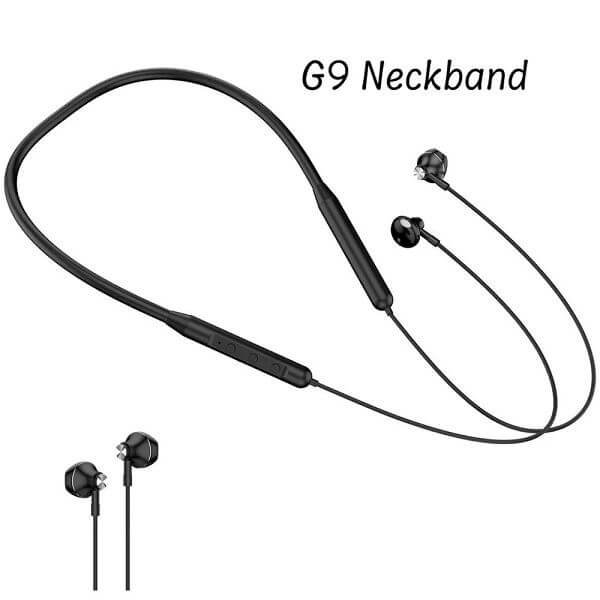
GearUP G9 Neckband Magnetic Metal Earphone With Good Quality Microphone
In stock
Original price was: ৳1,050.00.৳450.00Current price is: ৳450.00.
SKU:
DGT-1012851
T55 Pro Max Smart Watch With Earbuds & Double Strap- Black Color
In stock
Original price was: ৳1,950.00.৳1,350.00Current price is: ৳1,350.00.
SKU:
DGT-1012741-BK


Baseus Bowie P1 Neckband Wireless Earphone
In stock
Original price was: ৳2,950.00.৳1,700.00Current price is: ৳1,700.00.
SKU:
DGT-1012823
Baseus Bowie P1x Neckband – Black Color
In stock
Original price was: ৳3,200.00.৳2,100.00Current price is: ৳2,100.00.
SKU:
DGT-1013978

G7 Bluetooth Neckband With Magnetic Headsets- Black Color
In stock
৳850.00
SKU:
DGT-1012472
| Color |
Black |
|---|---|
| Size |
Free Size (Anyone Can Use) |
| Battery |
Runtime 72 hours ,Up to 6 hours music time |
| Connectivity |
Advanced Bluetooth 5.2 |
| Features |
Built-in high sensitivity ,Ensure crystal ,High-quality sound ,Microphone ,Noise canceling technology ,Stereo sound quality |
| Hardware |
Upgraded BT V5.2 chip |
| Supported |
Android ,iPhone ,Laptop ,Others Bluetooth-Enabled Devices ,PC |
| Quality |
Brand New |
| Brand |
China |
| Made In |
China |
| Warranty |
30 Days Warranty |
G8 Sports Neckband With Magnetic Headsets
In stock
Original price was: ৳950.00.৳400.00Current price is: ৳400.00.
SKU:
DGT-1012718
GearUP G9 Neckband Magnetic Metal Earphone With Good Quality Microphone
In stock
Original price was: ৳1,050.00.৳450.00Current price is: ৳450.00.
SKU:
DGT-1012851

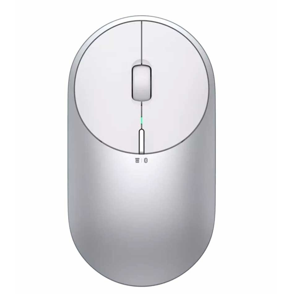
Mi Dual Mode Wireless Mouse Silent Edition Bluetooth 2.4 GHz Connect 1300 DPI
In stock
Original price was: ৳2,999.00.৳1,750.00Current price is: ৳1,750.00.
Black
White
Select options
This product has multiple variants. The options may be chosen on the product page
SKU:
DGT-1011059
Trendy Hot Selling WIWU Crystal Transparent Wireless Mouse
In stock
৳1,700.00
Gray
Sky Blue
Select options
This product has multiple variants. The options may be chosen on the product page
SKU:
DGT-1013076-67

UGREEN Wireless Mouse 2.4G Silent Computer Mouse 4000 DPI – Black Color
In stock
Original price was: ৳2,899.00.৳1,800.00Current price is: ৳1,800.00.
SKU:
DGT-1014417

Xiaomi Lite 2 Wireless Mouse
In stock
Original price was: ৳2,290.00.৳1,150.00Current price is: ৳1,150.00.
SKU:
DGT-1014416
Xiaomi Mi Portable Wireless Mouse 2 Dual Modes Mouse
In stock
Original price was: ৳3,199.00.৳2,100.00Current price is: ৳2,100.00.
Gray
Silver
Select options
This product has multiple variants. The options may be chosen on the product page
SKU:
DGT-1014025
EKEN H9R Action Camera with Accessories
In stock
Original price was: ৳10,900.00.৳6,900.00Current price is: ৳6,900.00.
SKU:
DGT-107320
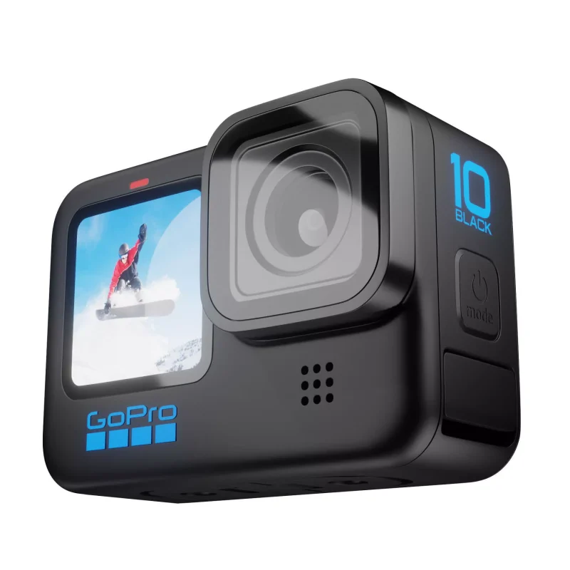
GoPro Hero 10 Black Action Camera
In stock
Original price was: ৳47,500.00.৳40,500.00Current price is: ৳40,500.00.
SKU:
DGT-1009986
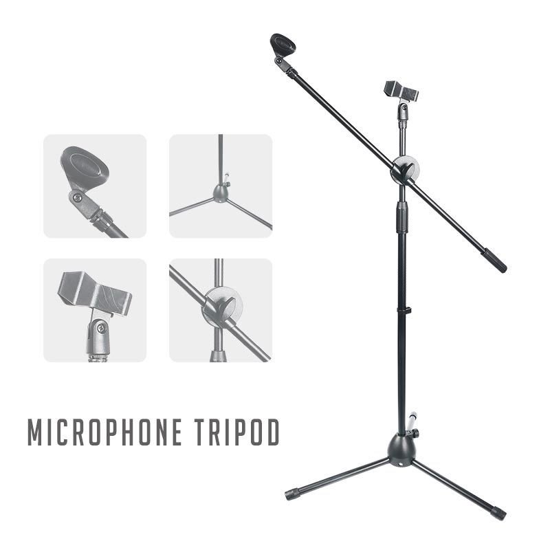
Microphone Floor Stand With Adjustable Two Microphone Holder (LW-38)
In stock
Original price was: ৳4,800.00.৳2,200.00Current price is: ৳2,200.00.
SKU:
DGT-107660
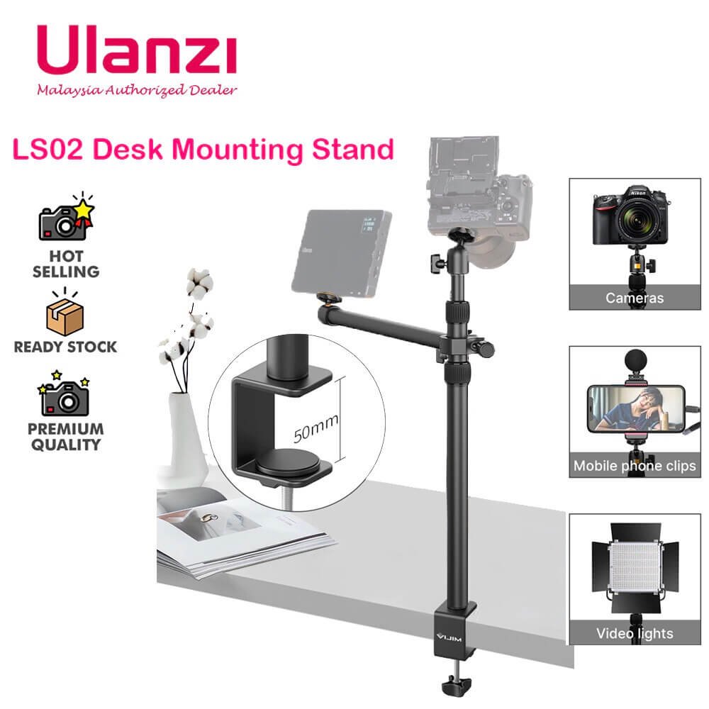
Overhead Desk Mount Stand for DSLR, DSLR & Ring Lights (Ulanzi VIJIM-LS02)
In stock
Original price was: ৳3,950.00.৳2,700.00Current price is: ৳2,700.00.
SKU:
DGT-1011298
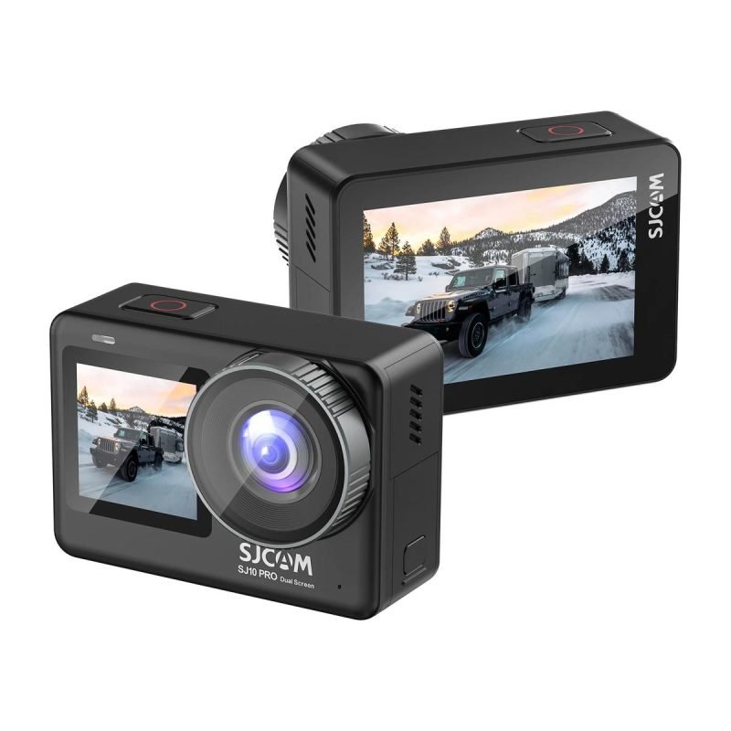
SJcam SJ10 Pro Dual Screen Action Camera
In stock
Original price was: ৳25,000.00.৳20,000.00Current price is: ৳20,000.00.
SKU:
DGT-1011331
Overhead Desk Mount Stand for DSLR, DSLR & Ring Lights (Ulanzi VIJIM-LS02)
In stock
Original price was: ৳3,950.00.৳2,700.00Current price is: ৳2,700.00.
SKU:
DGT-1011298
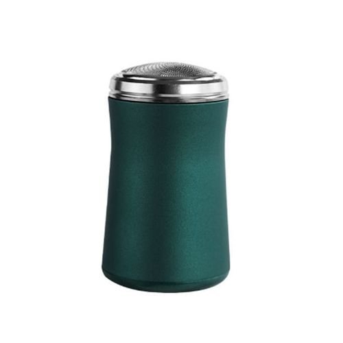
Mini Waterproof Rechargeable Shaving Machine
In stock
Original price was: ৳1,890.00.৳1,150.00Current price is: ৳1,150.00.
SKU:
DGT-1013027

Panasonic Compact Travel Electric Shaver ES3831K
In stock
Original price was: ৳4,600.00.৳2,850.00Current price is: ৳2,850.00.
SKU:
DGT- 1011817

Panasonic Multi-System Trimmer (ER-240)
In stock
Original price was: ৳4,890.00.৳3,250.00Current price is: ৳3,250.00.
SKU:
DGT-105103

Panasonic Spinet Compact Shaver (ES534)
In stock
Original price was: ৳2,980.00.৳2,050.00Current price is: ৳2,050.00.
SKU:
DGT-1011807

PHILIPS BT1230 Beard Trimmer
In stock
Original price was: ৳2,699.00.৳1,550.00Current price is: ৳1,550.00.
SKU:
DGT-1012294